
630-354-0556
What Every Local Business Website Needs on Its Homepage
Your homepage has one job: get the visitor to take the next step. Call you. Book an appointment. Fill out a form. Walk through your door.
That's it. Not impress them with your company history. Not list every service you've ever offered. Just get them to act.
Most local business homepages fail at this because they're built around what the owner wants to say instead of what the visitor needs to see. Here's what actually belongs there.
Above the Fold: What They See Before Scrolling

Everything visible on the screen before a visitor scrolls is called "above the fold." This is prime real estate. If the right things aren't there, most people won't stick around to find them.
1. A Clear Headline That Says What You Do and Where
Not your tagline. Not your business name. A plain statement of what you do and who you do it for.
"Plumbing and drain services in Aurora, IL" is better than "Your trusted local partner." One tells a stranger exactly what you do. The other says nothing.
Include your city or region in the headline. It tells Google where you are and tells the visitor they're in the right place.
2. A Phone Number That's Impossible to Miss
Top right corner of every page. Clickable on mobile. Big enough to read without squinting.
Local customers want to call. Make it the easiest thing on the page to do.
3. One Primary Call to Action
What's the one thing you most want a first-time visitor to do? Call you? Book online? Request a quote? Pick one. Put a button for it front and center. Don't offer four options and hope they pick the right one.
Trust Signals: Why They Should Choose You
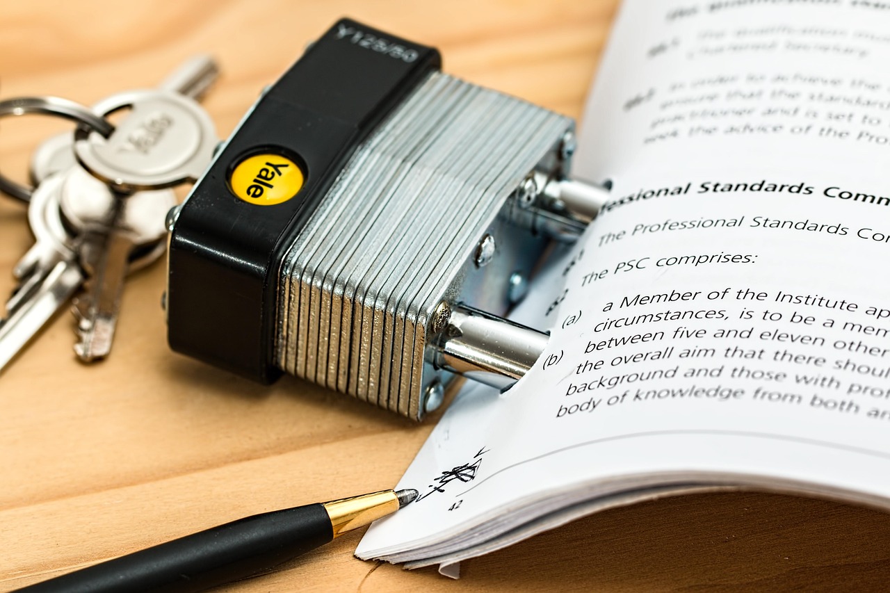
A visitor who doesn't know your business is making a judgment call. They're asking: is this legit? Are other people happy with them? Your homepage needs to answer those questions fast.
4. Real Reviews or Testimonials
Pull a few of your best Google reviews and display them on the homepage. Better yet, show your star rating and review count with a link to your Google profile. Social proof is one of the fastest ways to build trust with someone who's never heard of you.
5. Real Photos
Photos of your actual team, your actual work, your actual location. Stock photos feel fake and customers can smell them. A photo of a real technician in a real uniform doing a real job is worth more than any stock image of a smiling professional in a hardhat.
A fencing company in Waukegan replaced all their stock photos with before-and-after shots of actual jobs and a team photo taken in the parking lot. Not professional photography, just good phone photos. Bounce rate dropped. Calls went up. Real works.
6. Your Credentials or Differentiators
Licensed? Insured? Family-owned? 20 years in business? Award-winning? These things matter to customers choosing between you and a competitor. Put them somewhere visible, not buried in an "About" page nobody reads.
Navigation: Make It Obvious

7. A Simple, Clean Menu
Four to six menu items max. Services, About, Contact, and maybe one or two more. If your menu has twelve options, visitors freeze up trying to figure out where to go.
Keep it simple. Make "Contact" or "Book Now" stand out visually from the rest.
The Homepage Checklist

| Element | What It Does | |
|---|---|---|
| ☐ | Headline with service + location | Instantly tells visitors (and Google) what you do and where |
| ☐ | Clickable phone number at top | Makes calling the easiest thing to do |
| ☐ | One clear primary CTA button | Tells visitors exactly what to do next |
| ☐ | Real photos of team or work | Builds trust faster than any copy |
| ☐ | Reviews or star rating visible | Social proof closes the gap between interest and action |
| ☐ | Credentials or trust badges | Licensed, insured, years in business, reduces hesitation |
| ☐ | Simple navigation (4–6 items) | Makes finding information effortless |
| ☐ | Fast load time on mobile | Keeps visitors from bouncing before they see anything |
What to Leave Off Your Homepage

Just as important as what you include is what you leave out. These things slow visitors down or distract them from the one action you want them to take:
- Long paragraphs about your company history (save that for the About page)
- Auto-playing videos with sound
- Pop-ups that fire immediately
- Sliders with five rotating headlines
- More than one primary CTA (pick one)
- Cluttered footers with too many links
Simple pages convert better. Every time.
Is Your Homepage Turning Visitors Into Customers?
We'll take a look and show you what to fix, free, no obligation.
Get a Free Website Review